Design Operations at Optym

overview

As a design leader my job is to create and execute better processes within the design team to create more efficient and communicative workflows between internal team members and cross-functional teams with the overall goal of developing the design maturity of the company. The following outlines design operations I have worked on at Optym.

role

UX Lead Designer, UX Manager
Lead all phases of the discovery and design process with a team of 5 designers.

tools

Figma, FigJam, Pastel, Jira

Key Achievments

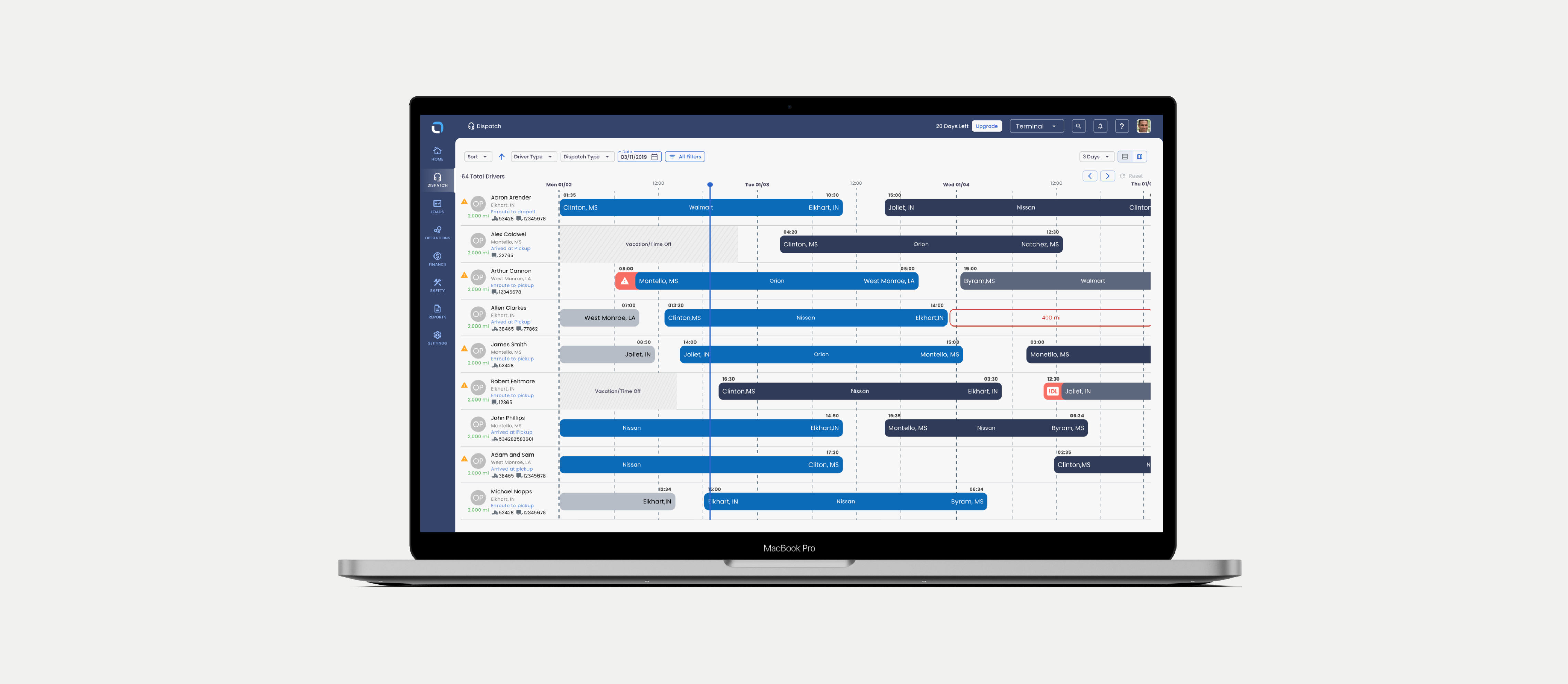
I joined Optym as the Lead Product Designer in 2022 in a company without any formal UX Leaders. I lead design across every aspect of the business over multiple projects, the application shown here (Optym TMS), Optym Load AI (an AI based R&D project) and the Optym TMS Driver mobile app.
A few key achievements I brought to Optym which I have listed below:
  • Established a systematic approach to discovery, Designers that were previously on the team did not have a lot of experience completing discovery, this showed them what options they have and how to summarize the feedback.
  • Improved the design QA process.. Existing documentation and processes did not exist on how to conduct design QA, the communication between front-end and UX was very rudimentary.
  • Brought Design Thinking to the larger team. DT opens up a powerful toolbox, I came in and showed the larger product team some of that toolbox and opened their eyes to a new perspective on ideation and decision making.
  • Aligned the Information Architecture for design and discovery artifacts. Design files and discovery artifacts had no organization, I gave these documents structure to allow all team members to easily find and read artifacts.
  • Formalized UX UI design reviews. These best practices allowed designers to understand how to critique in a structured manner and develop their skills in the right way.
  • Created a designer performance system. This allowed me (UX Lead) and the business to understand how efficient each designer was, if they had a relatively high level of quality work and what types of tasks they worked on.

How we work together

overview

The overall product team numbered 60 members (7 Design, 10 product, 40 engineering) all working towards building the same product. Defining clear ways of communicating was an issue, the following showcases the processes implemented to allow effective and clear communication in working together.

POD Team Structures (Cross-functional communication)

the problem

No cohesion or familiarity with other team members, people barely knew who to talk to from other teams, tons of overlap on who makes decisions or who is working on an item.

Initial High Level Product Team Communication Behavior

THE SOLUTION ( POD STRUCTURE)

Adding a substructure for product teams by placing 1 designer, 1 product member and 3-5 engineers on one team gave everyone a sense of familiarity, clear lines of communication and more clearly defined roles and responsibilities.

How we get work done

overview

Setting clear standards for designers to work individually and in a team so all products members can understand design status, design use cases/alternatives, designer notes for handoff and general organization for documentation purposes removes confusion between designers.

Organizing Figma boards
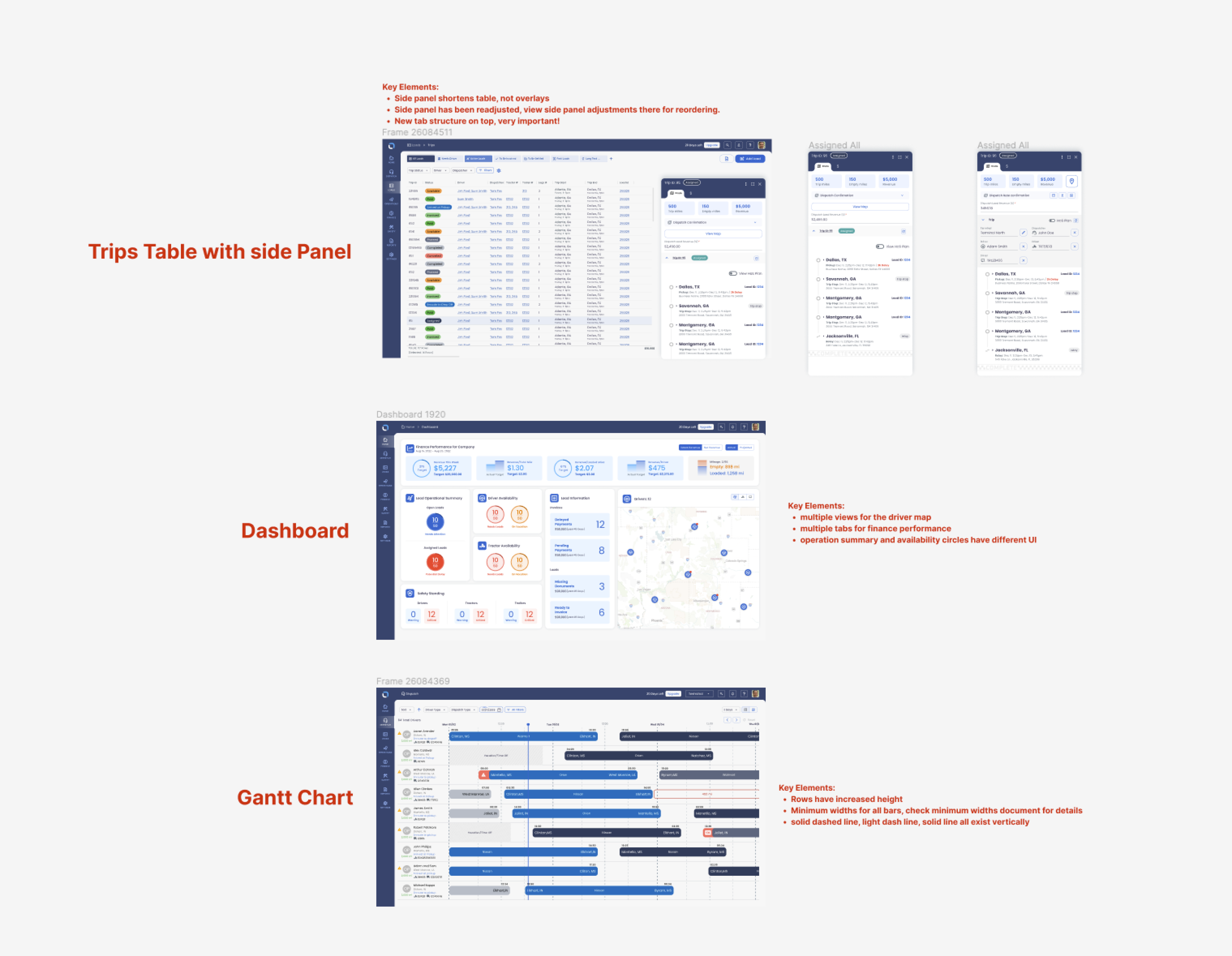
Before flows had no organization, art boards were all over the place, only the designer who worked on the story could decipher what was happening, with this simple approach flows are labeled, key elements are noted making it easier for any product member to interpret the designs.

Organizing Figma pages
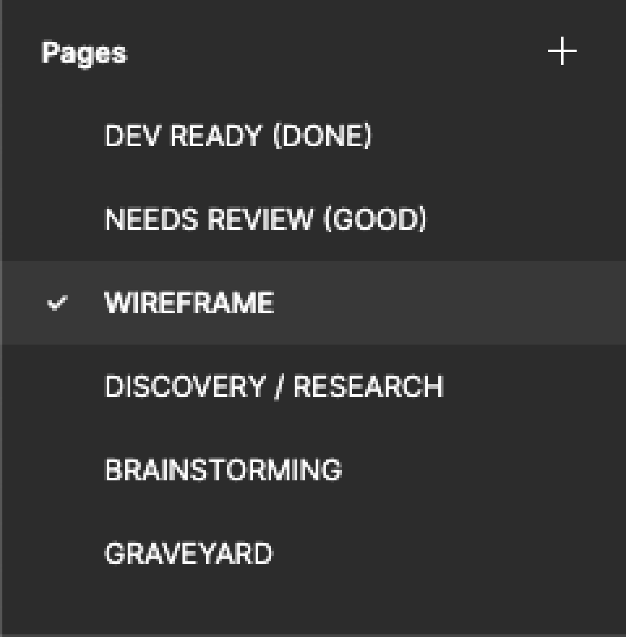
Having multiple pages showcasing status and separate parts of the design process for all designers design files allows easy navigation, clear separation for review and status for designers to show leaders and all product members.

Effectively executing Design QA

Step 1

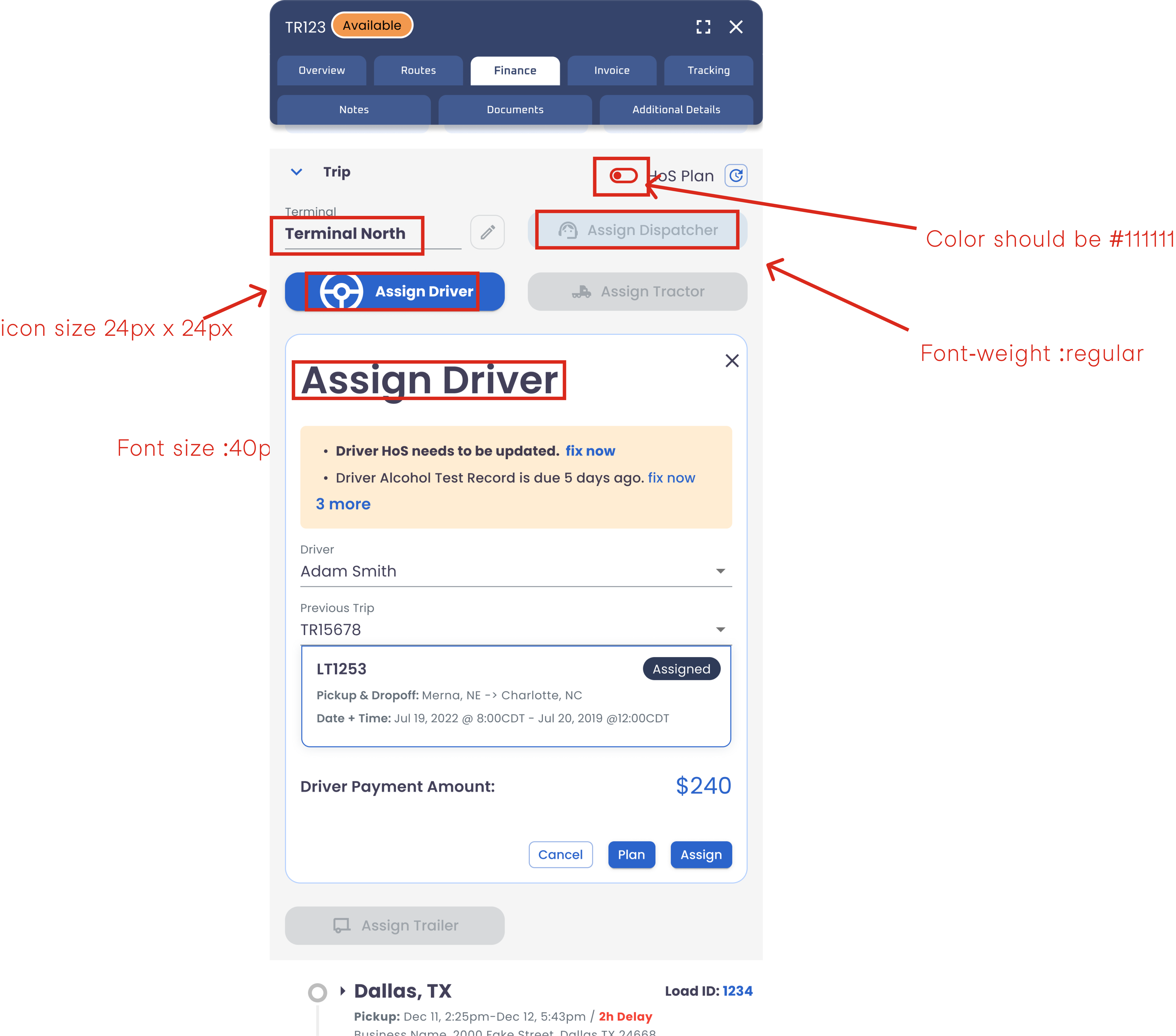
Initially design QA was done via word doc, this was rudimentary and ineffective and not leveraging figma as a product tool for the entire team. Initially we moved from word docs to placing design QA directly on a design, although rudimentary it was the first step. Obviously taking screenshots and pasting them into figma and using a comments feature also works here, but this was just an initial step.
step 2

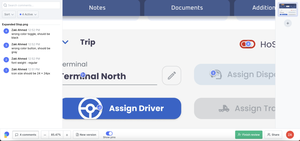
We needed a tool to organize and effectively communicate design QA directly from a dev or production environment. Introducing “Pastel”, a tool that allowed us to version, tag and comment on production and dev releases to QA effectively with minimal effort.
How our work creates impact

overview

Understanding the workload, work efficiency and effectiveness of each design on a team can allow designers and a design team. The following outlines my approach that I have used to measure these metrics with design members which gives leadership the information needed to push designers to the next level, hold them to high standards and more effectively manage designers workloads.

Designer Performance Rating

How do you assess a designer’s performance? My approach is below, I want to make it clear that this grading system was a work in progress and has clear gaps, but I needed a way to hold standards for designers.

Average Story Points

I defined a story as 30 points maximum for UXD and 40 points maximum for visual designers. How do we break that down to effectively rate a design story? I needed to know how much effort in theory this story would be.

DEFINING a story

Story definition for ux designers

  • discovery needed (research, interviewing, testing) - rating/10
  • New UI work needed (color treatment, visual/illustrations, new visual controls)- rating/10
  • Wire framing needed / flow design - rating/10

Story definition for visual / graphic designers

  • Color palette creation (max 10 points)
  • New UI elements- controls, cards etc. (max 8 points)
  • Illustrations / Re-coloring (max 10 points)
  • After effects / animations (max 10 points)

Average Quality of Work Score

Designers have to be clear systematically on their progressions when coming to a potential solution, without some guardrails many designers will not output high quality work consistently. The following defines parameters on how designs are vetted for consistency. The scale is taken out of 40 points.

DEFINING the quality of work

Variables for a quality of work score (Max 40 points)

  • Delivering work on time (if scope has not changed) (every business day late -2 pts /10 total) (max 10 points)
  • Handling alternative and side cases - arbitrarily rated based on # of cases missed (mobile included) (max 10 points)
  • Spelling / consistency of padding / margins via an 8 px grid setup - arbitrarily rated based on 3 metrics described (max 10 points)
  • # of revisions needed (due to change in scope (scope = requirements / user feedback / team feedback) , poor quality) (max 10 points)

Defining scale for quality of work

“Good” Design Score (Qualitative)

At the end of the day, some designs are great and some not so much, this is obviously subjective on some level but designers know good design work, this is an attempt to hold designers to high standards and push them creatively. I admit this method has clear bias based on pre-conceived notions. Initially I had other designers perform this qualitative check but in the end I vetted all of these myself.

DEFINING “Good” design

Variables for defining “Good” design

Designs are judged based on 3 guiding principles:
  • quality of work
  • creativity
  • aesthetics

This would be a qualitative assessment with clear notes and feedback. These designs may have been seen as effective within a design sprint but is now seen with a fresh lens and time taken to identify gaps with a fine tooth comb.