Optym Trucking Gantt Chart
overview
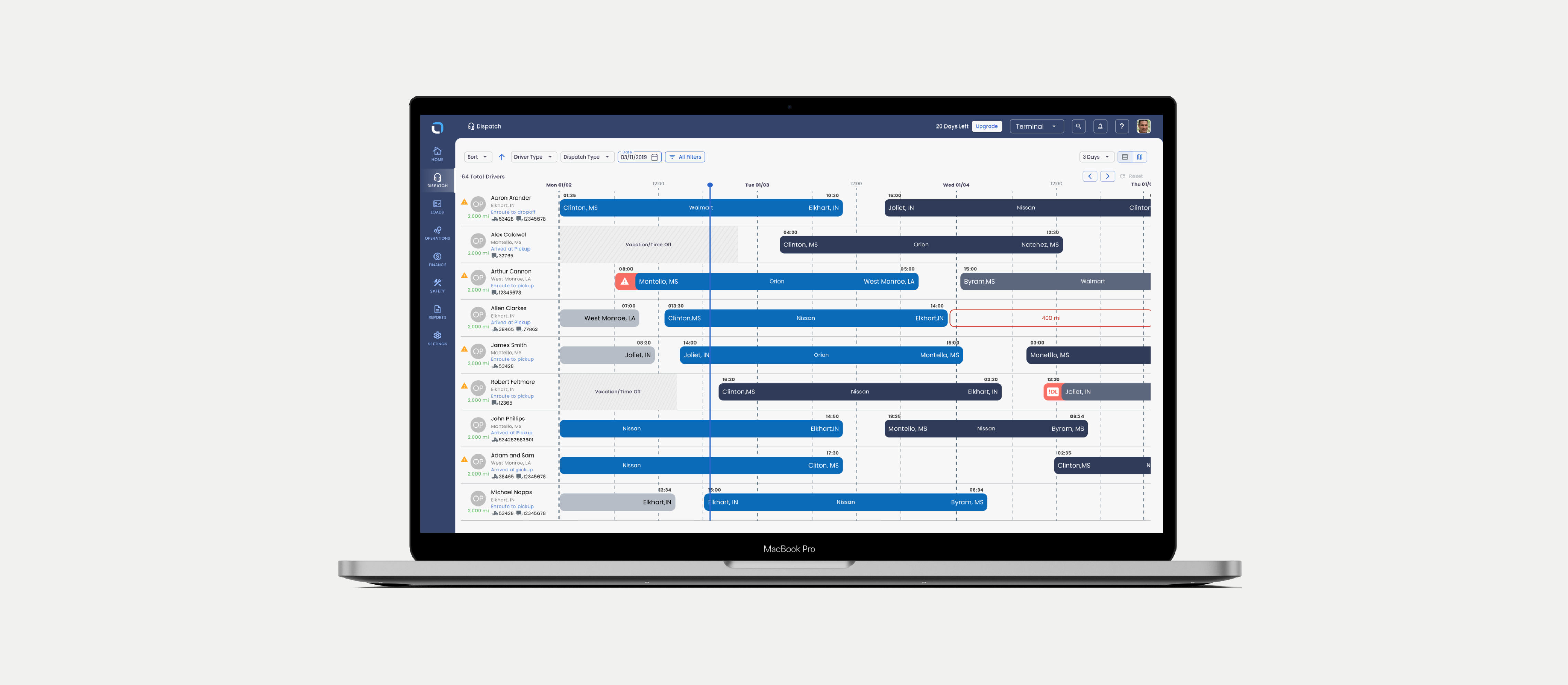
Managing a trucking companies day to day real time logistics is a complex endeavor. Trucking planners (core user) need to understand everything about the incoming load, available drivers, metrics on profitability and distance etc. This B2B SaaS product was designed to allow planners to make quick decisions about scheduling loads and drivers that maximize profit.
problem
Planners want to make quick decisions about scheduling loads and drivers that maximize profit.
Planners need transparency on profitability as well as truck load information and driver availability when scheduling deliveries. These decisions have to be made relatively quickly with as much informed information as possible.
solution
Design for scannability, emphasize profitability at every corner.
Our research and usability testing led the design team to emphasize the core concept of allowing the the planners to scan the most important information quickly while also clearly showing profitability based on a planners potential decision.
Discovery
Approach
The application had an existing legacy gantt chart but was arguably the most important part of the application, we needed to analyze this gantt chart in a variety of ways. The discovery process used here is one I have used often in my career and can be outlined below:
- User feedback sessions of the existing system
- UX / UI design review with the entire design team
- Usability test using current v1 system
- Feedback from Customer Success team members on issues customers are consistently having
Note: Usually I would use quantitative data as part of my discovery process but at the time this product did not have robust tracking of data of the application set up, we had access to simple metrics via the data team and a very limited user base.
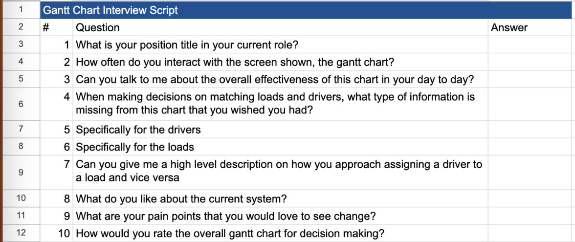
User feedback session script

Planner Mindset
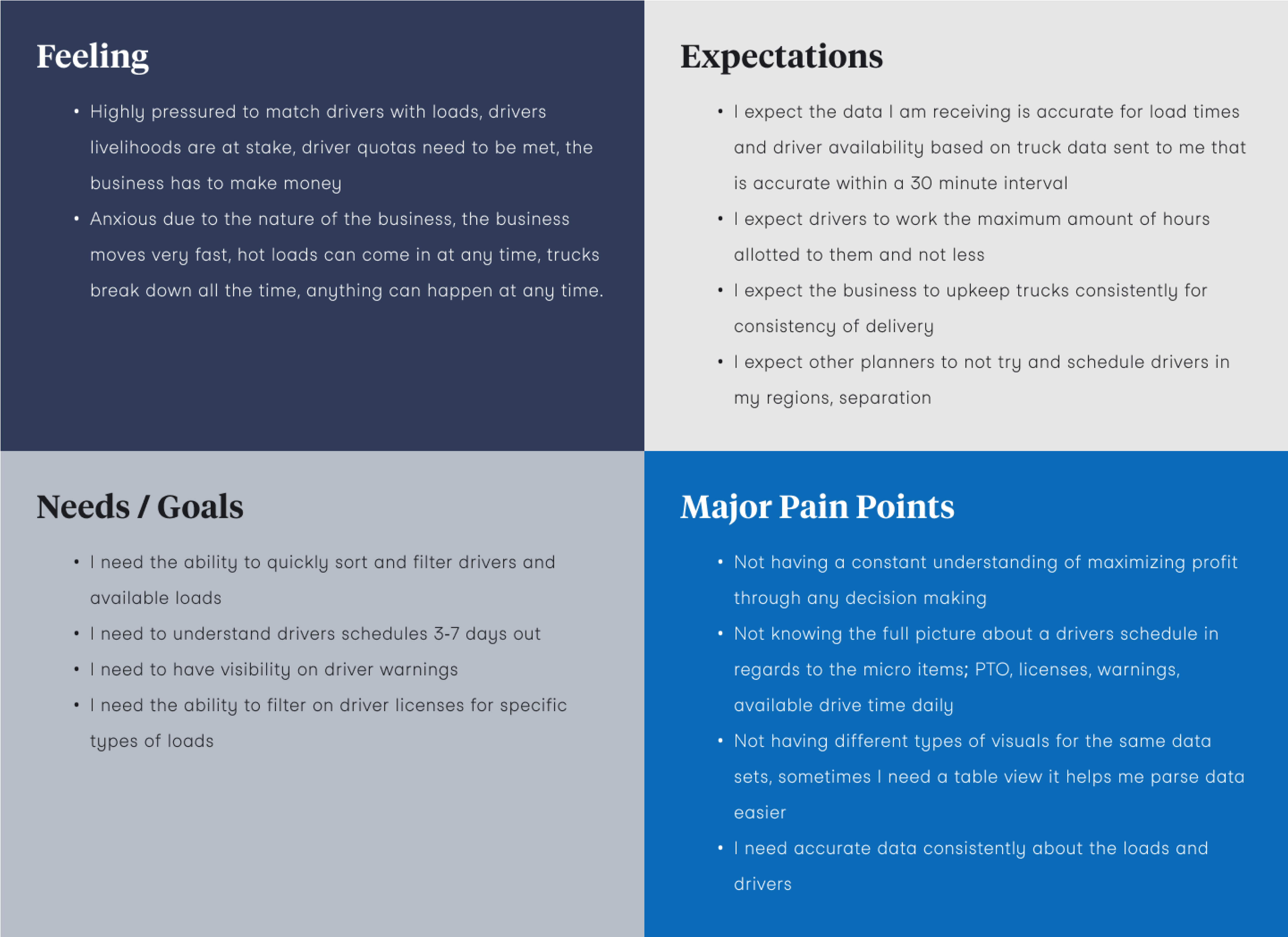
I will be using the phrase “planner” throughout this UX case study, I would like to define it here. A planner is our core user for this application and is someone who works in the trucking planning space as either a small business owner or more importantly a professional who's job is to optimize the businesses revenue based on how they see fit to match truck loads and available truck drivers together. You can view the planners “mindset” below.

interview conclusions
Planners were frustrated with readability and clear context of profitability, what were the possible repercussions or successes from a decision?
UX/ UI design review
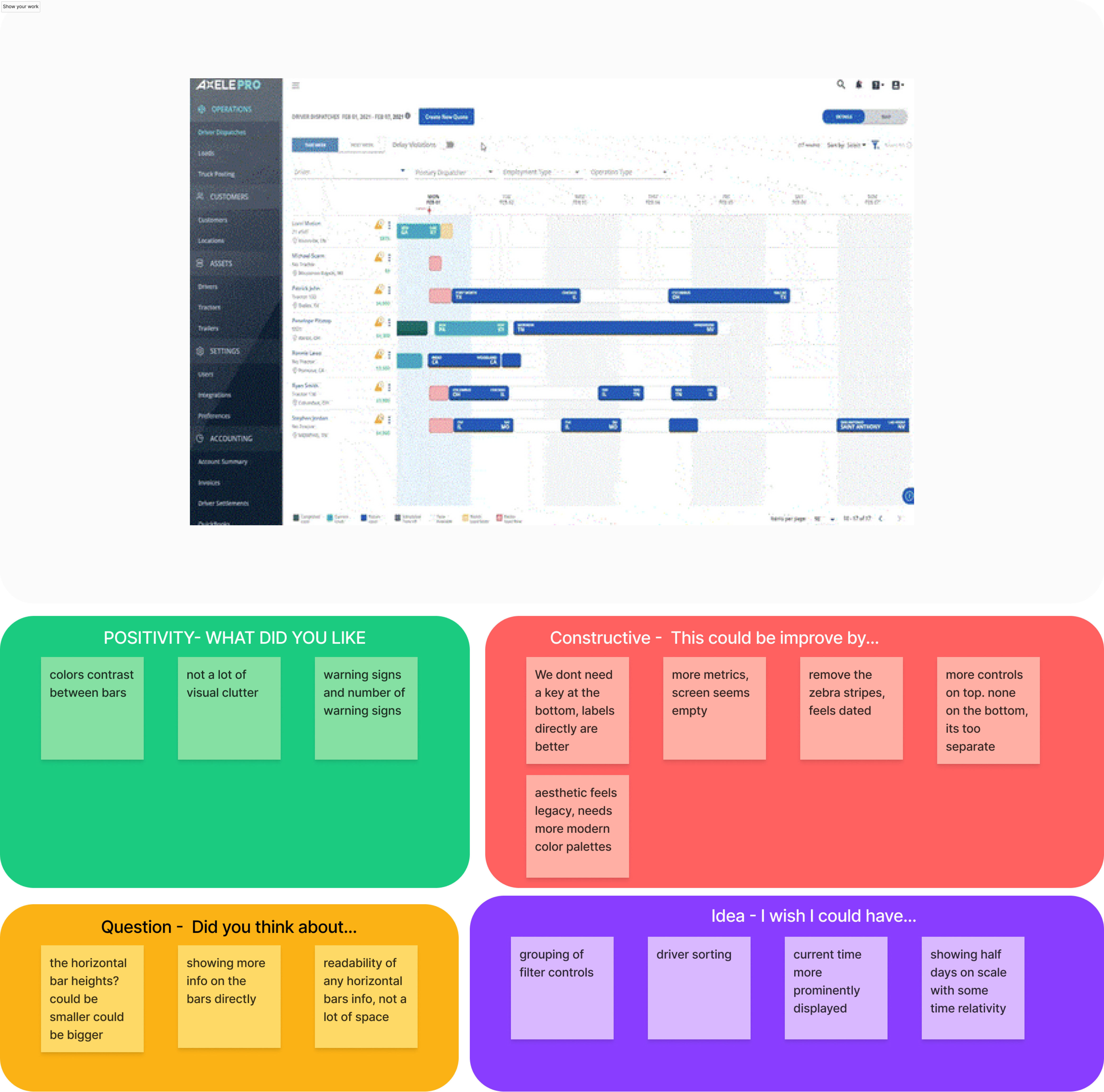
Here we can see the legacy version of the application, I apologize for the pixelated screenshot. The design team had a variety of critiques for the existing application and below are some of the main ideas we focused on.

UX UI Design review conclusions
We needed to reduce visual clutter, increase sizing, group controls and add more robust but concise sorting and filtering to promote quicker and more informed decision making.
Define
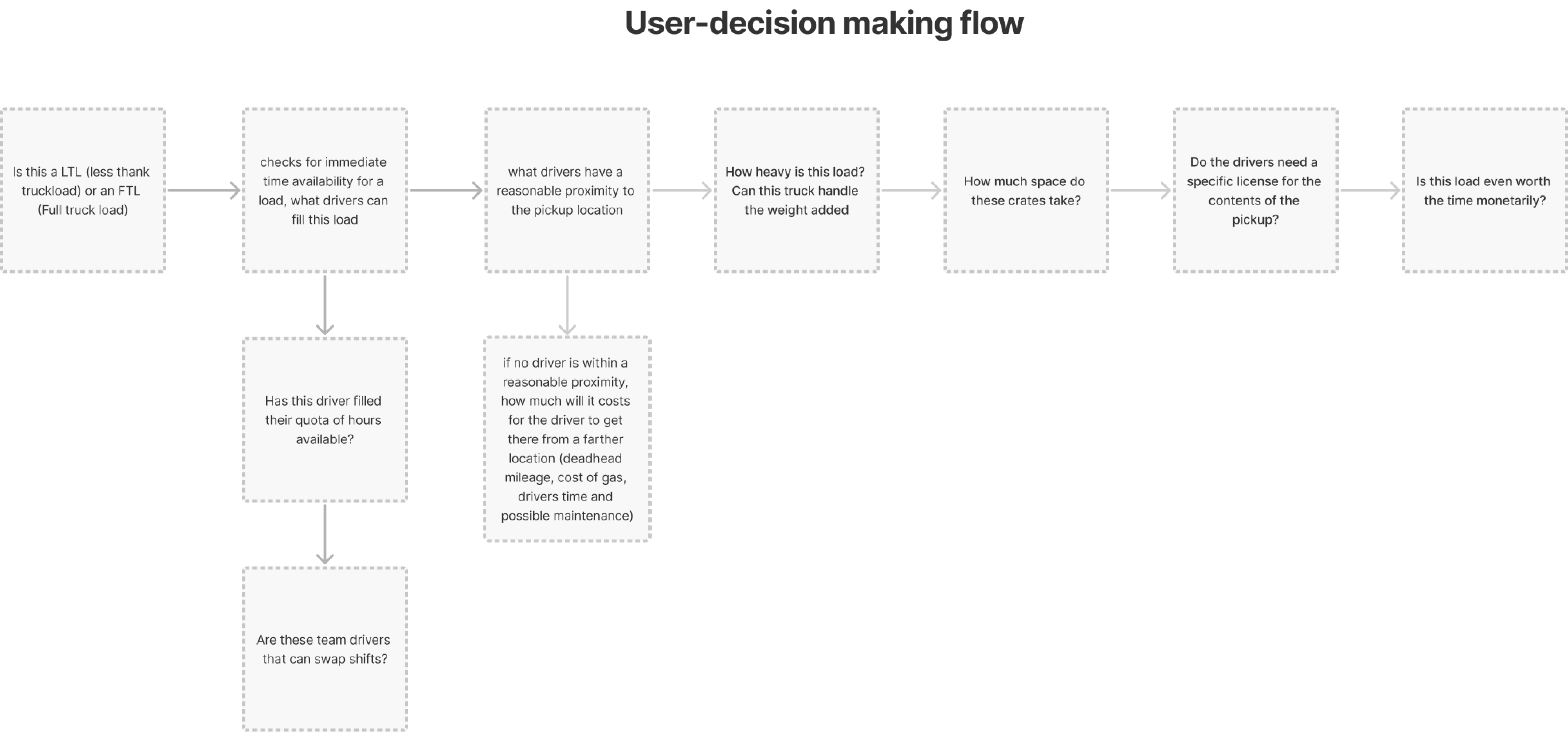
User-decision making process flow
This flow outlines the specific progressions planners make when matching a load to a driver and a driver to a load, in general there are many exceptions but for the purposes of our application this level of specificity was acceptable.

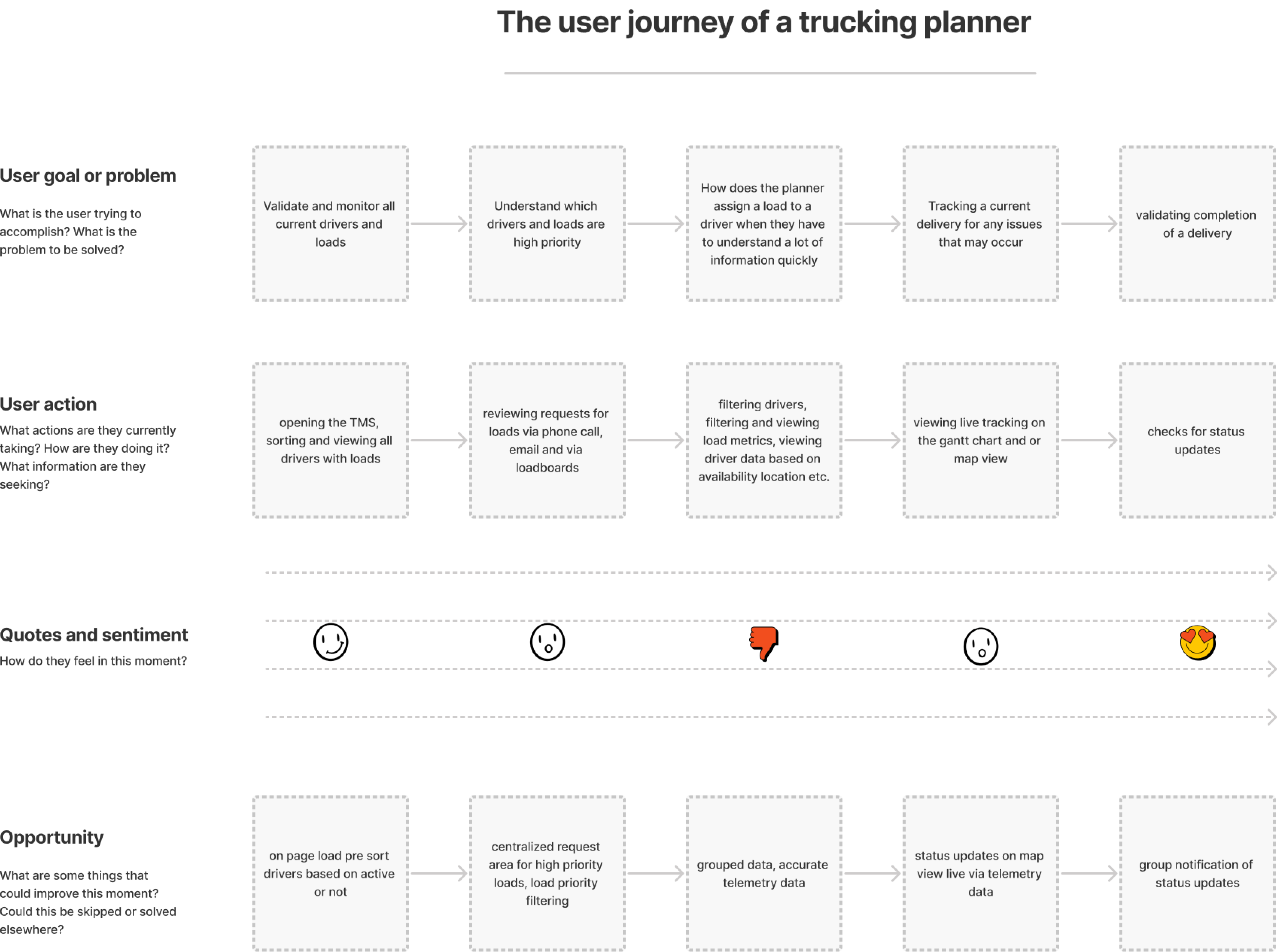
User-journey map
This journey map outlines how planners make decisions, what progressions they go through at a high level and a typical day of how they interact with the application, this was important because many product team members were new and there was not a general consensus on how things work, the prior discovery was quite old. This journey map has been simplified for readability.

process flow + user journey conclusions
Planners have a general set of clear progressions, lets design based on those progressions when emphasizing or de-emphasizing certain areas.
LUMA Design Thinking Workshop, group, prioritize and ideate
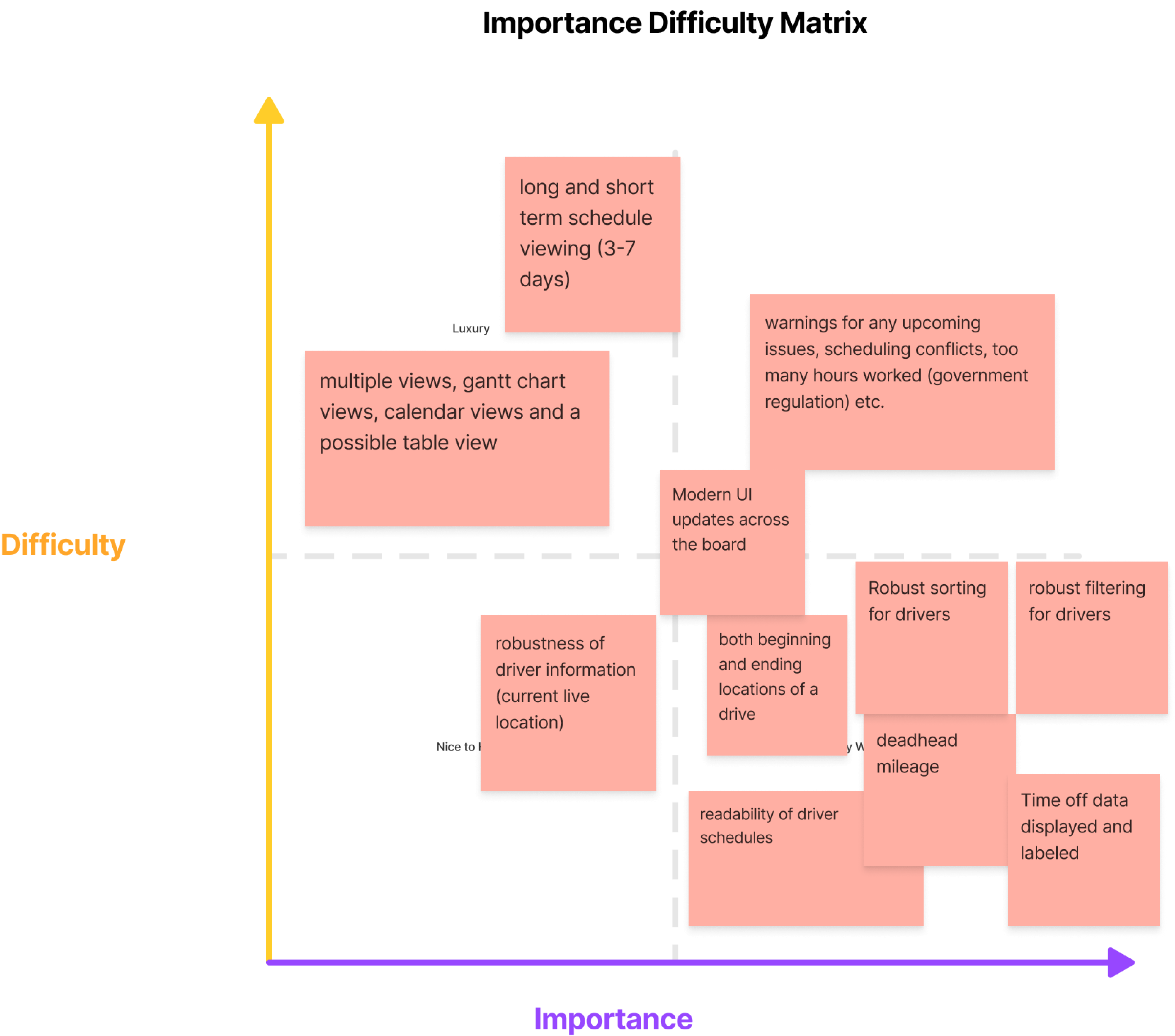
After gathering all of the discovery feedback and analysis, we aggregated everything and placed all of the items onto stickies for a workshopping session. This workshop would include key members from the larger product team (UX, Product, Engineering & Customer Success).
The workshop would have a few targeted outcomes as shown below:
- Transparency to the entire product team on existing issues and user feedback
- Prioritization of issues and feedback
- Solution ideation from these prioritized issues

Design thinking workshop conclusions
Identifying and emphasizing profitability metrics coupled with more robust sorting and filtering were clear high priority targets the product + design teams wanted to approach first. Quick scannability for decision making was integral for the planners minute to minute workflow.
Ideate
Lo-Fi Wireframes
This is how we approached a very early wireframe, with some new information based on feedback, we already in parallel had been working on a new design system for a complete overhaul.
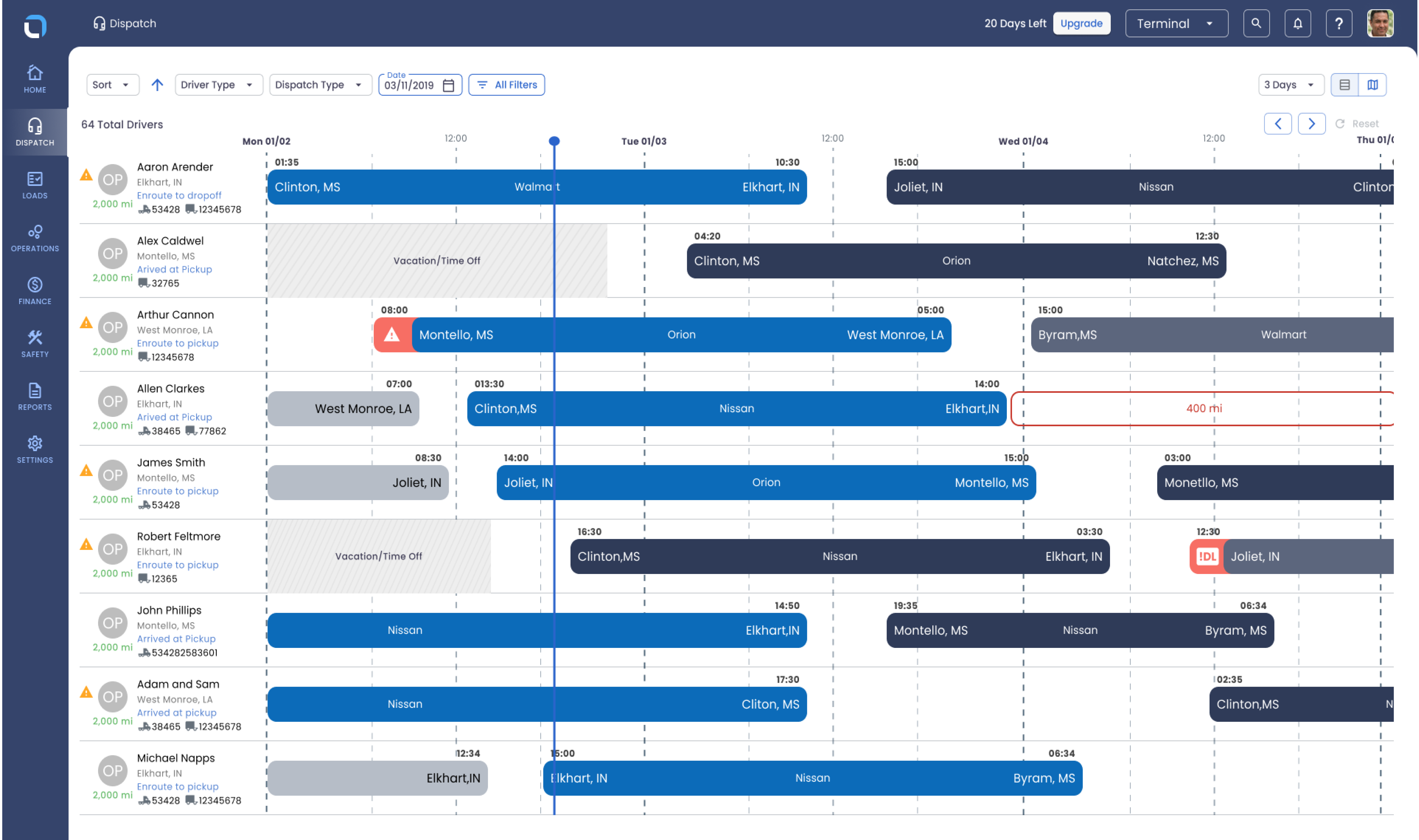
Hi-Fi Prototype
After we we combined the discovery feedback, the wireframe with our existing UI kit and a lot of iteration. We have our hi-fidelity prototype.

Usability Testing
Me and the team conducted usability testing with our primary users to validate whether the new designs were an improvement from the legacy platform and addressed the concerns they had. I wrote a light script asking users to interact with certain new features and giving us feedback on specific areas and things we wanted to point out.
After the sessions we aggregated all the feedback and got to some conclusions.
-
Some users liked smaller rows of bars so they could see more drivers and some users liked thicker rows for readability
-
The preset filters we used originally that were not in the all filters section needed some change
-
The liked the All filters popup and was an “ah-ha” moment for them
- Sorting was very much liked
-
New telemetry data was good but we had to do some reworking for some items in a side panel popup.
-
the 3-5-7 day dropdown on the top right was not immediately clear, we had to have some onboarding for that
-
The table view on the view changer was not useful, only the map view so we removed it.
Usability testing conclusions
Multiple ways of viewing the same information were at a premium, not all planners work the same. Robust sorting and filtering was a big success and allowed for quicker and more informed decision making.
Results and takeaways.
Launching this new core functionality with an entire rebrand and rebuild of the legacy application was admittedly tough. There were a ton of bugs and UI issues that needed fixing, a ton of design QA, design hand-off, re-hand-off (haha), onboarding coupled with early mornings and late nights with overseas teams to get this off the ground.
Some key results and takeaways from this project are:
- It is okay for some features to be robust, our user base does complex work and need a lot of information and that is okay, we have customer success, virtual and automated onboarding for a reason.
-
Designer to developer handoff needs to be precise, hold developers accountable for micro UI issues, those issues pile up for later
-
Make sure stakeholders are kept in the loop, sometimes they do not understand all the context you’ve been working with and do not understand your decision making, keep them in the loop so theres no surprises at any turn.
-
Multiple ways of viewing the same information allowed the product to be more versatile for a wider range of users
-
Readability and robust sorting and filtering were widely accepted and emphasized by users.
-
Clear profitability metrics throughout made planners feel more comfortable making decisions.
