Unifying therapist scheduling to improve care and drive growth
Enterprise UX
Healthcare SaaS
Legacy modernization
Workflow unification
Modernizing scheduling for therapists by unifying fragmented workflows into a single, tablet-ready experience.
I was the lead product designer for a team of 4
We used Figma, FigJam, Miro & Material design
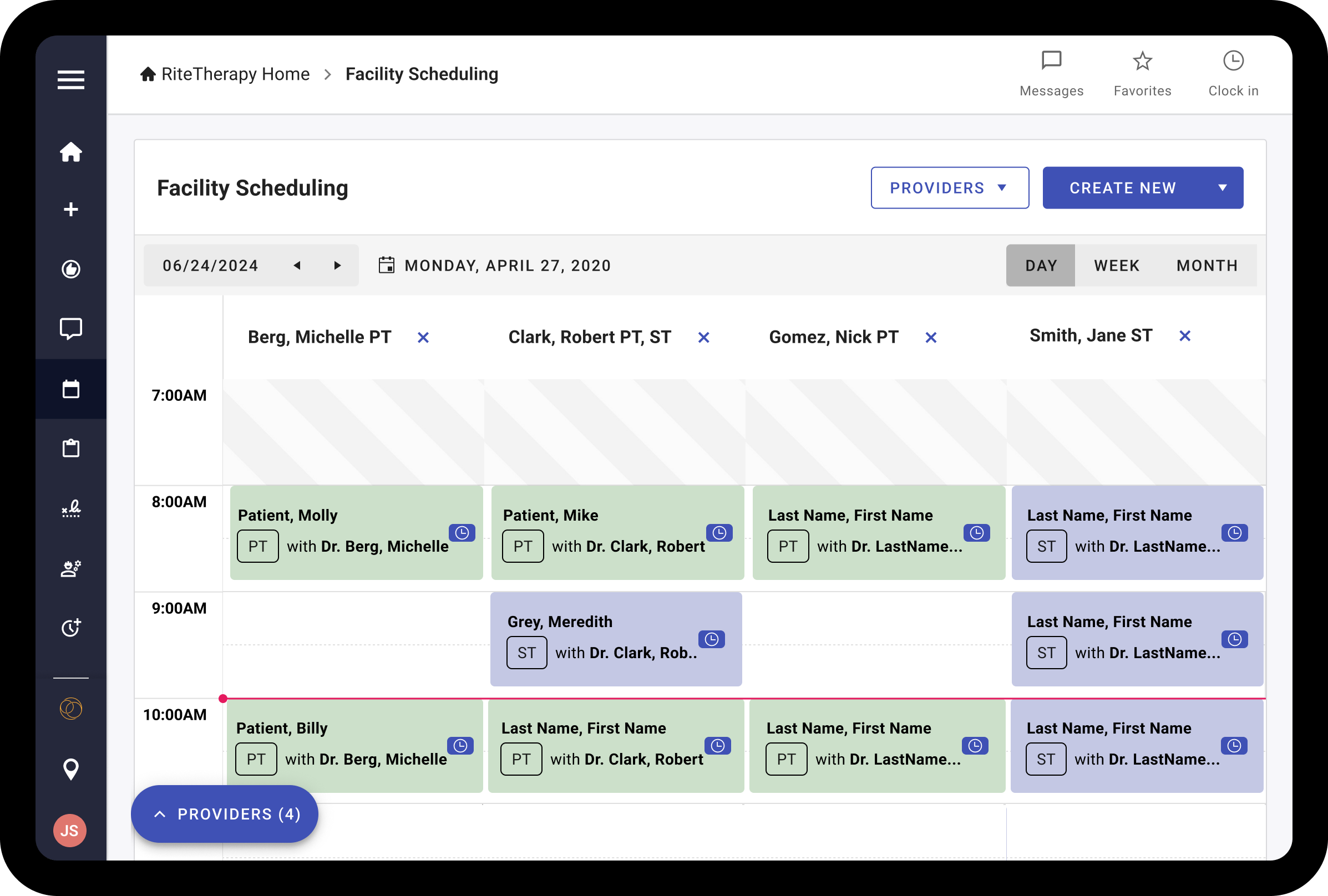
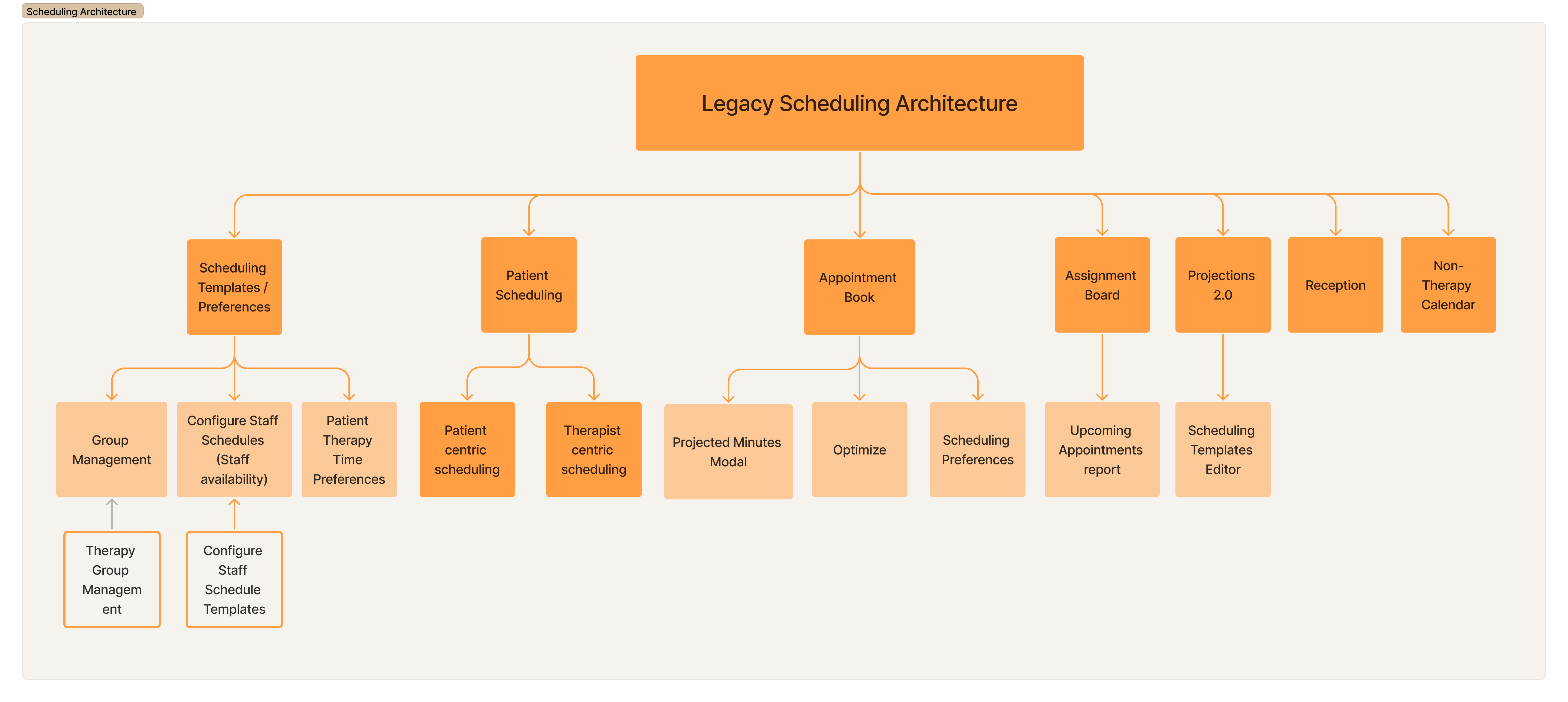
3 different ways to schedule a patient
9 different scheduler controls
A lack of centralized actions
Custom controls that don't map to modern web controls
Therapists struggled to schedule patients because the system had three outdated schedulers with confusing controls, repeated features, and hard-to-read layouts, making it difficult to use and maintain.
Therapists are highly educated but rely on long-standing workflows, so changes must feel familiar to support adoption.
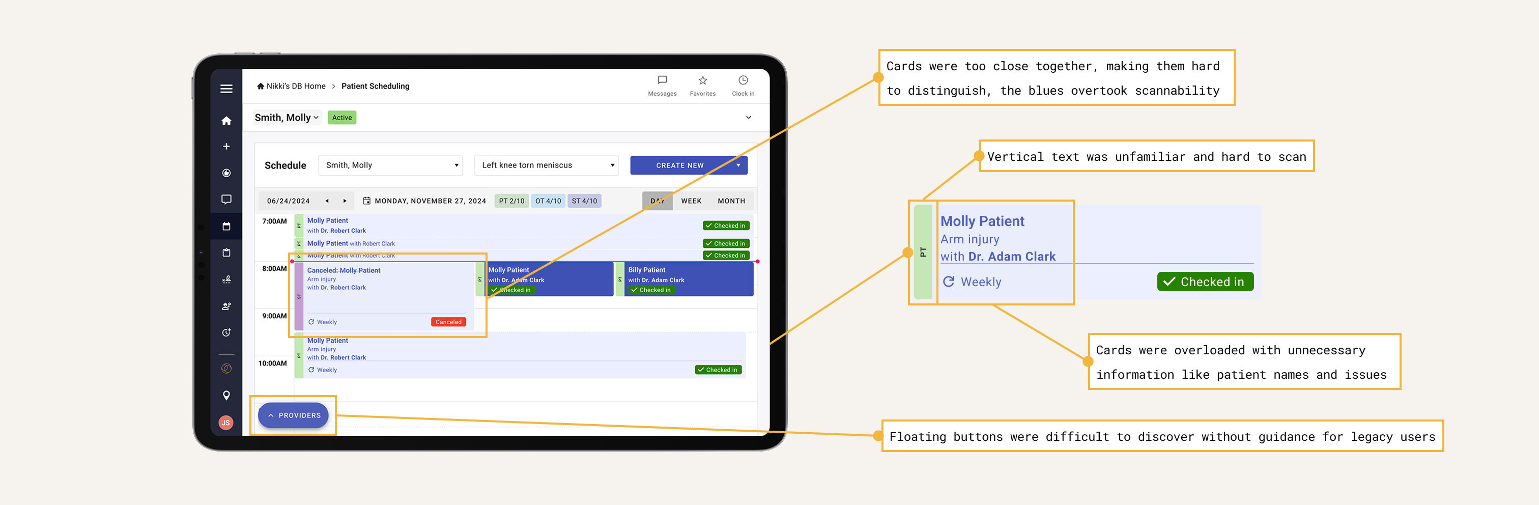
Poor readability and unclear availability made the schedulers hard to use and slowed onboarding.
Multiple overlapping schedulers confused users and made training difficult for the business.
Therapists need a tablet-friendly, offline-capable experience to work across facilities without Wi-Fi.
A fragmented system with 12+ separate workflows and redundant tools.
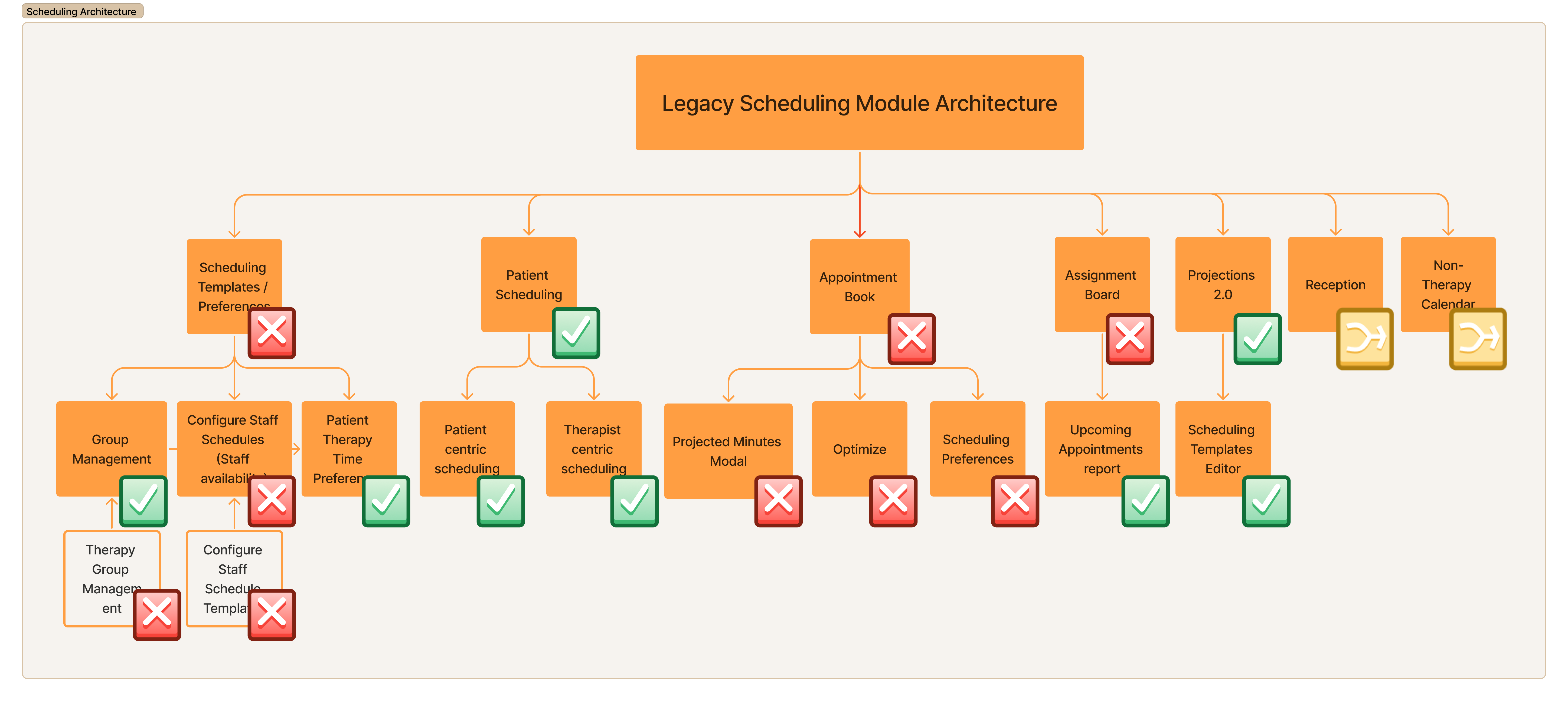
Analyzed what to keep, remove, or merge based on tech feasibility, usage data, and what truly helps therapists move faster with less friction.
A user-first redesign shaped by usage data, tech constraints, and speed-to-market goals.
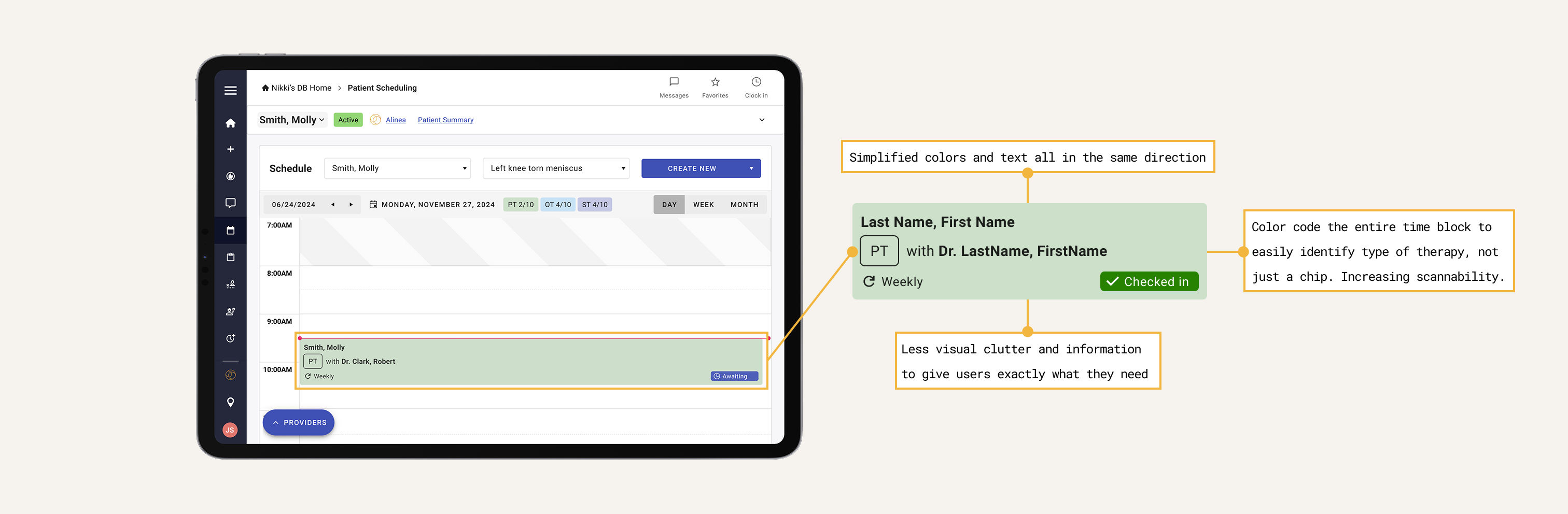
We focused on streamlining tools therapists actually used, removing distractions and optimizing for speed and clarity.
We cut bloat and prioritized essential workflows to reduce time-to-market and simplify onboarding.
Many legacy controls didn't map to today's web frameworks. We redesigned functionality that could translate cleanly into reusable, responsive components.
Using usage metrics and research, we removed underused features and merged overlapping ones to create a unified, intuitive experience.
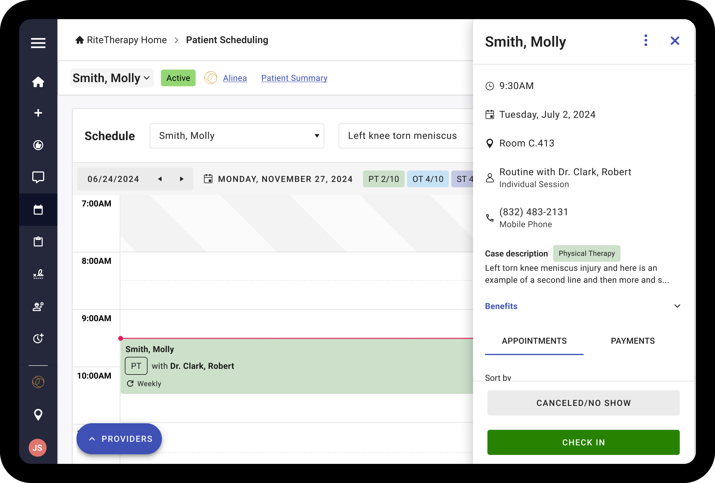
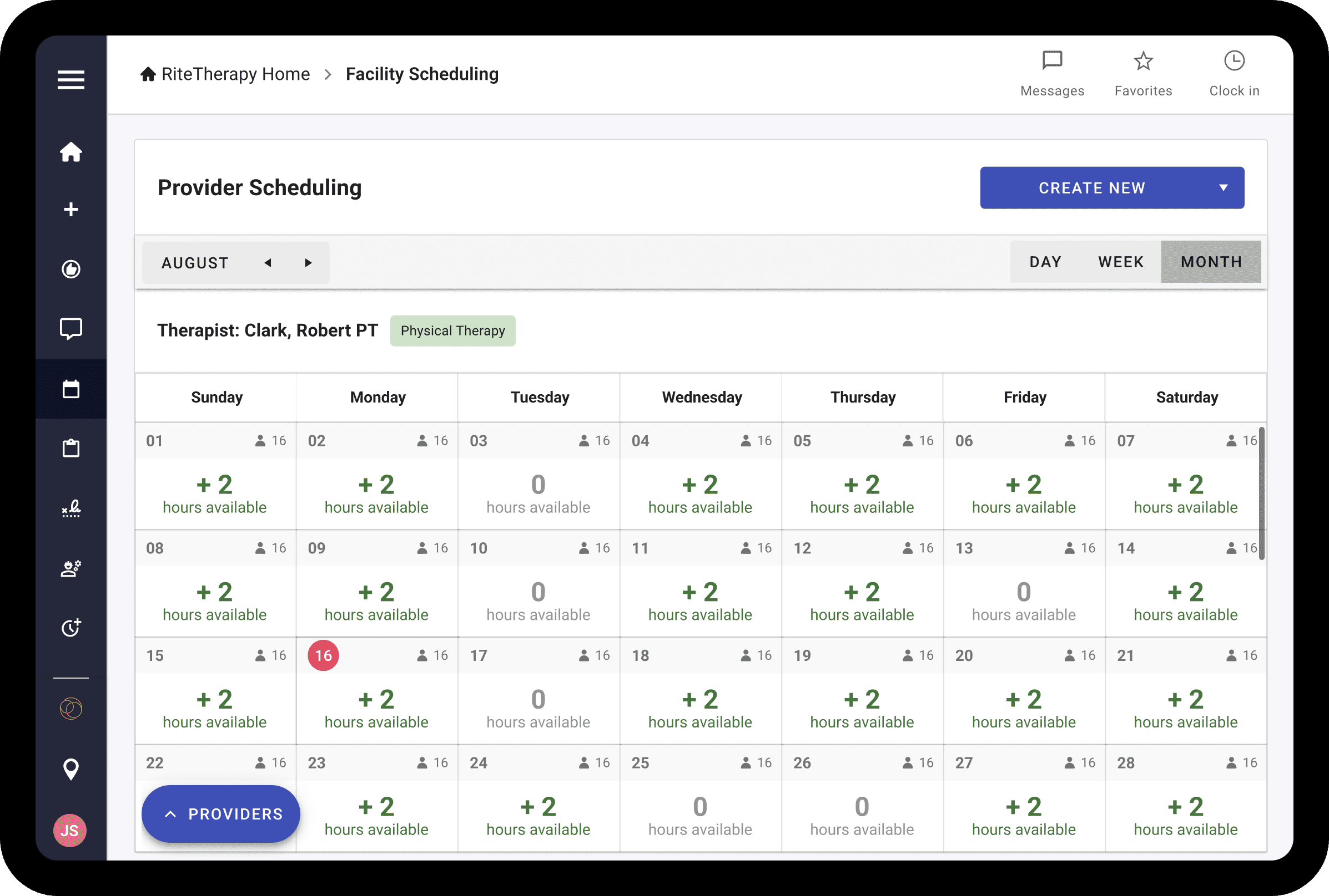
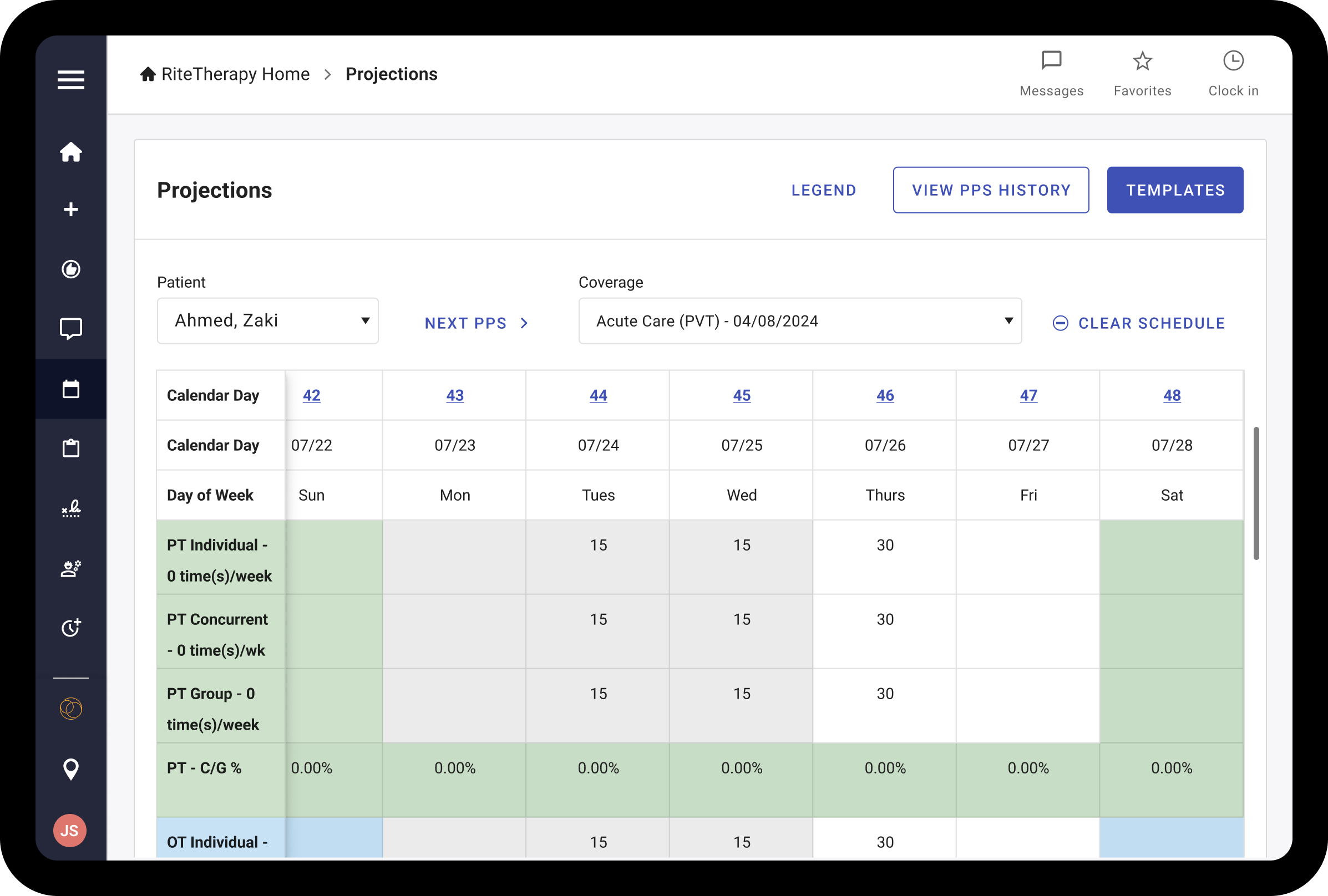
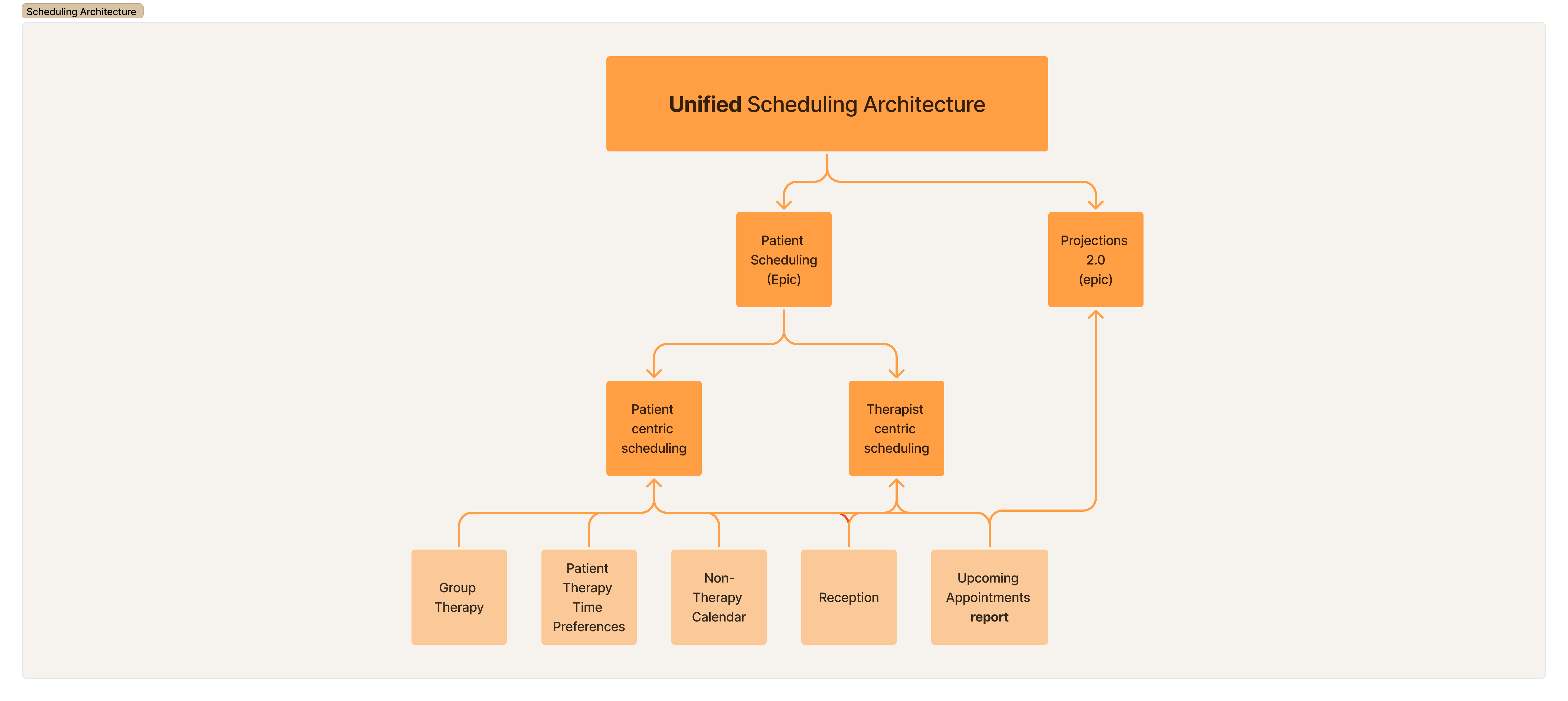
Simplified, consolidated architecture that streamlines all key scheduling workflows into one cohesive experience.
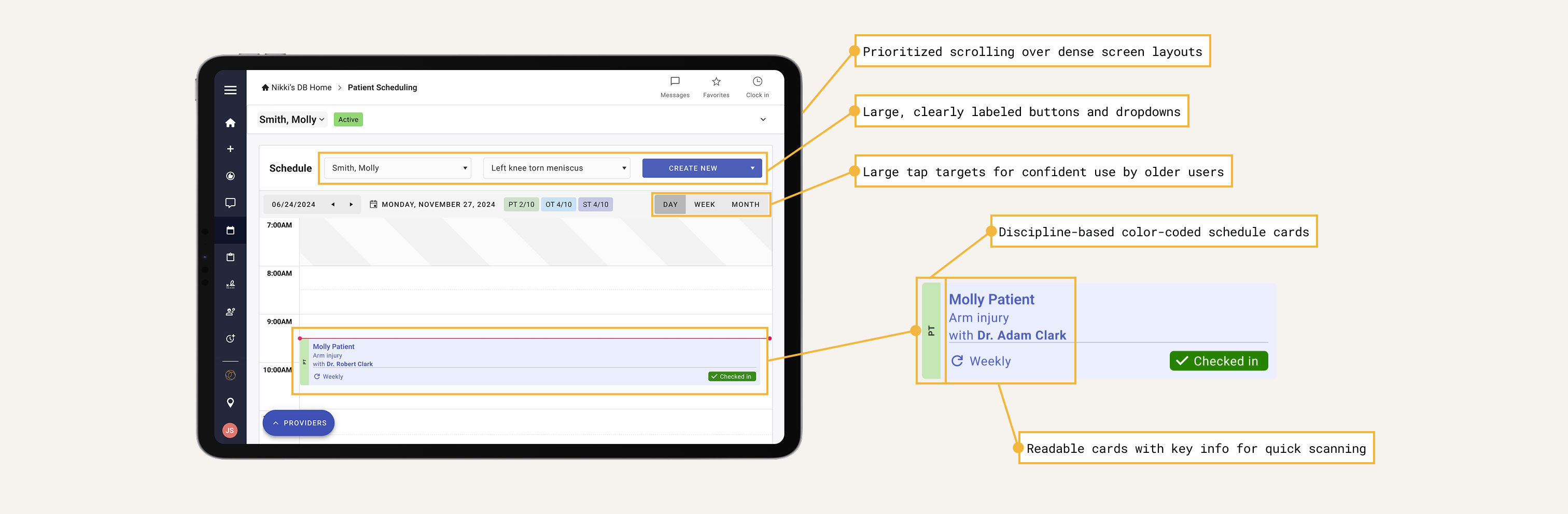
Early concepts built around therapist workflows, accessibility, and tablet-first scheduling
Insights from user sessions that shaped key usability improvements
A unified scheduling experience designed for clarity, speed, and real-world therapist needs
Measurable gains across speed, support, technical health, and time-to-market.
User testing showed significant improvements in time-to-task when completing real-life scheduling scenarios across patient types, facilities, and disciplines.
Intuitive design and in-app onboarding reduced the need for formal training sessions and live support.
Consolidating fragmented schedulers into one system enabled a single modern team to manage the product instead of relying on multiple legacy SMEs.
Prioritizing therapist workflows allowed us to ship a lean MVP faster while driving early adoption.
Key takeaways from navigating complexity at scale.
Balancing technical limitations, budget realities, and UX standards is critical to delivering a product that actually ships.
Focusing on therapists first created clarity in decision-making and ensured the product delivered meaningful value.
Where the product can grow next.
Future iterations should streamline admin tools with clear dashboards focused on revenue, availability, and business oversight.
"I'm incredibly proud of what our team delivered within the tight budget, timeline, and complexity of this project. We worked through late nights, constant iteration, and heavy constraints to create real improvements for therapists who rely on this product every day. This experience taught me how to lead with intention, compromise when needed, and push for higher standards when the value truly mattered. At the time, this project felt like my magnum opus and shaped how I approach building useful, scalable products under real-world constraints."
This legacy scheduler interface showcases the original design patterns and workflows that therapists have been using for years. The system required extensive training due to its complex navigation and non-standard controls.